Modelling MNAR data with population data #2 : Where do the blanks cluster?
The blanks are not spread evenly. Where they concentrate decides which question the data can honestly answer.
The data is the Cnam Cartographie des pathologies, published on data.ameli.fr under an open licence. It gives, for each pathology group, the number of people treated and the resulting prevalence, broken down by département, by sex, by five-year age band, for each year from 2015 to 2023. It is a large and unusually fine-grained table, and it is that fineness which makes the suppression visible at all.
The worked example throughout is the group Cnam calls «Autres cancers», in women aged 40 to 74.
Two words on why. Cervical cancer is not broken out anywhere in this dataset. Cnam folds it into that residual group, so the group is a stand-in and nothing here is a statement about cervical screening. The age band is the one screening actually addresses, which makes it the segment where a bias would matter to a decision rather than only to a table.
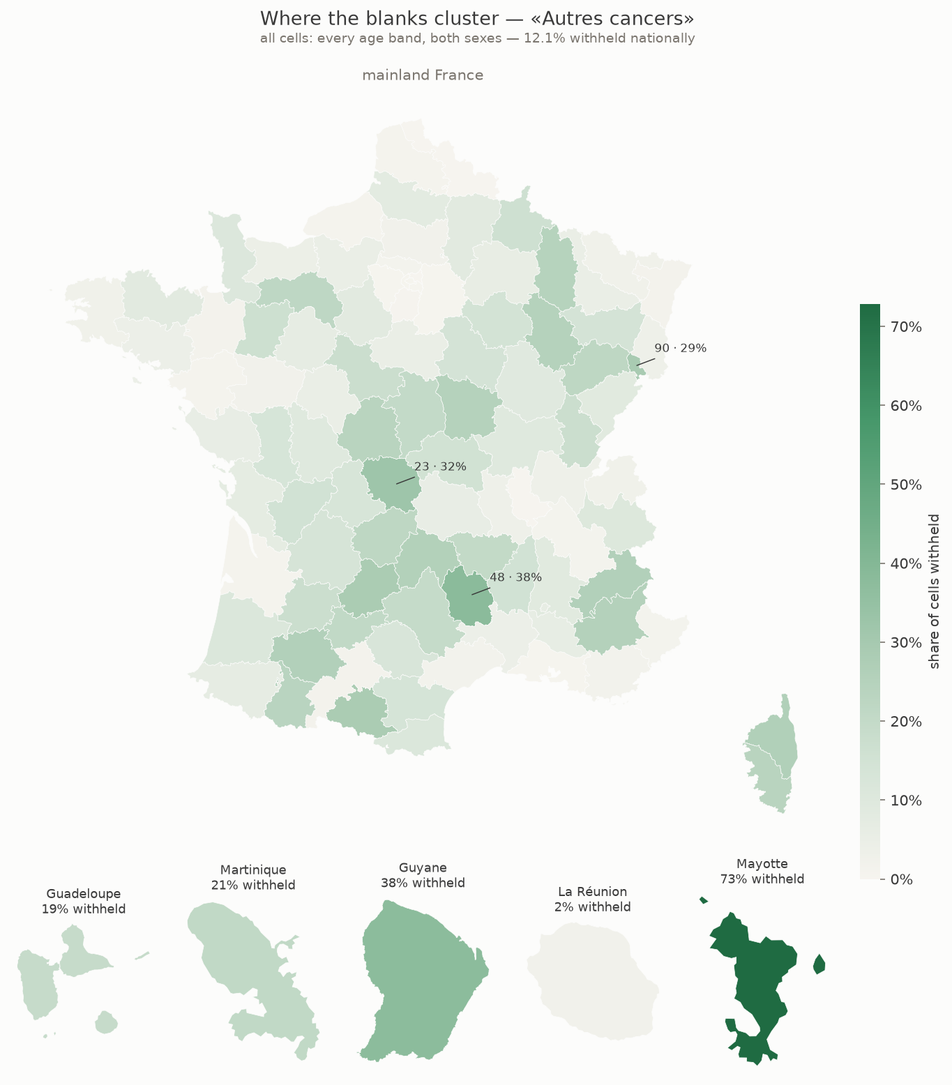
The first reading of the map is the obvious one, and it holds. Small territories lose more cells. Across the hundred départements the share withheld tracks population closely, and Nord, with two and a half million people, loses none at all.
The second reading is the one worth having. Size does not explain everything. Mayotte has around 129,000 people and loses 68% of its cells. Lozère has 74,000, barely more than half as many, and loses 39%. The smaller territory keeps more of its data.
The difference is age. Eight per cent of Mayotte’s population is aged sixty or over. In Lozère it is thirty-four per cent. Cancer prevalence climbs steeply with age, so the same headcount yields far fewer cases in a young population than in an old one. Mayotte has more people and fewer cases, and it is cases the threshold counts.
That is the previous post seen at the scale of a territory. Population and rate both feed the count, and the map shows only the first.
La Réunion is the control. It is young too, but it has 953,000 people, and it loses under one per cent. Enough of the first term compensates for the second.
What the map does not support is a demographic story told on its own. These are two plausible routes to a small count, read off a pattern that is consistent with them. Confirming either would take the age structure into the model, not into the caption.
This post covers one pathology group at département level. It does not cover the full pathology set, individual records, or any clinical reading of the rates themselves.
One number carries into everything that follows. Across all cells, 12.1% are withheld. Narrow to women aged 40 to 74 and that falls to 0.34%, which is 65 cells, 61 of them in Mayotte. The screening age bands are the older ones, and older bands hold more cases. Choosing the segment where a bias would matter is also, here, choosing the segment where suppression is rarest.
Next, what a model should do with a cell that has been withheld.
Données issues de la Cartographie des pathologies et des dépenses de l’Assurance Maladie, Cnam, data.ameli.fr, licence ODbL.