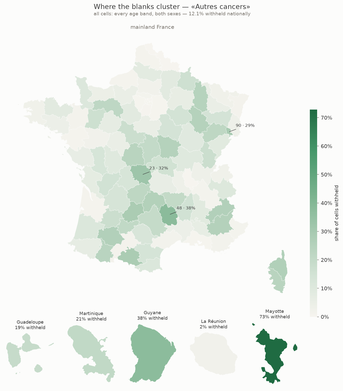
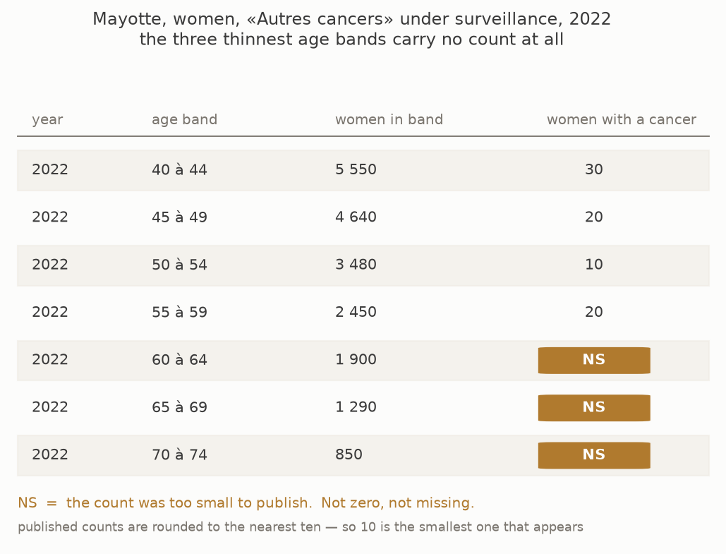
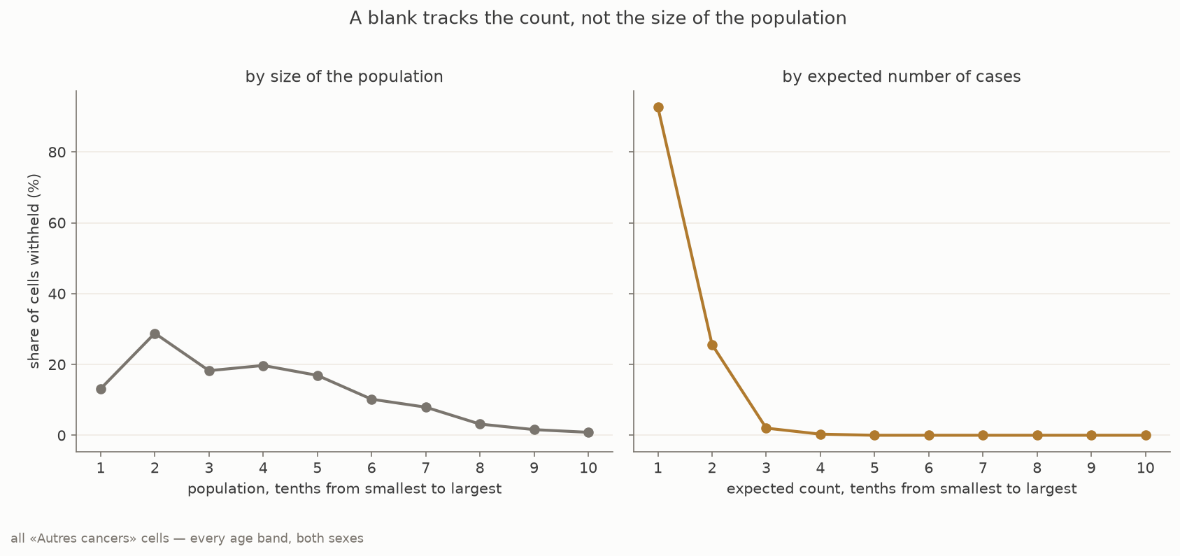
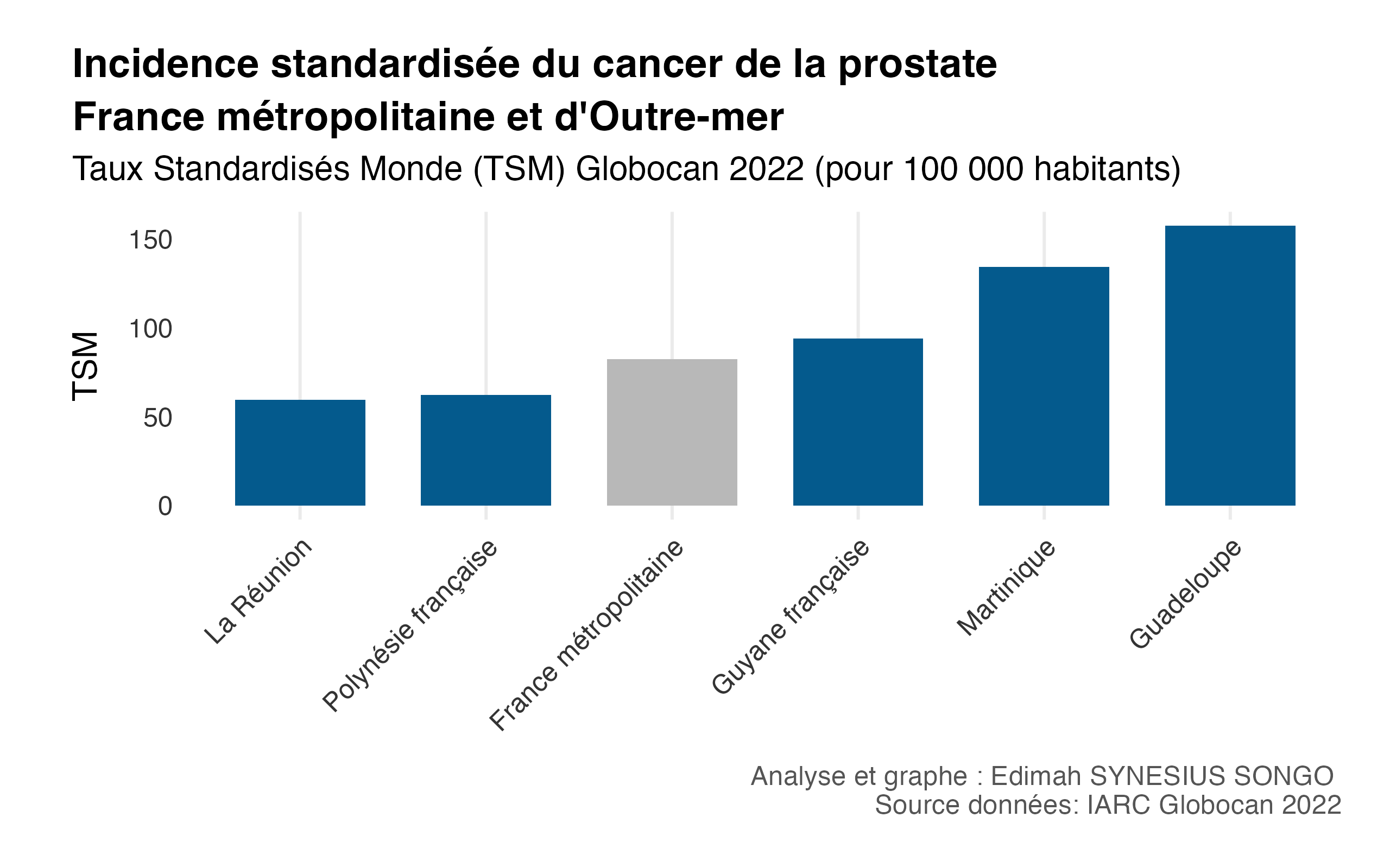
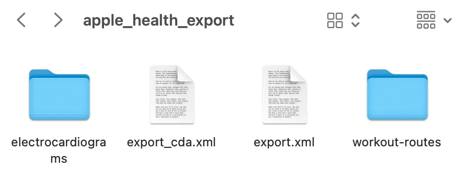
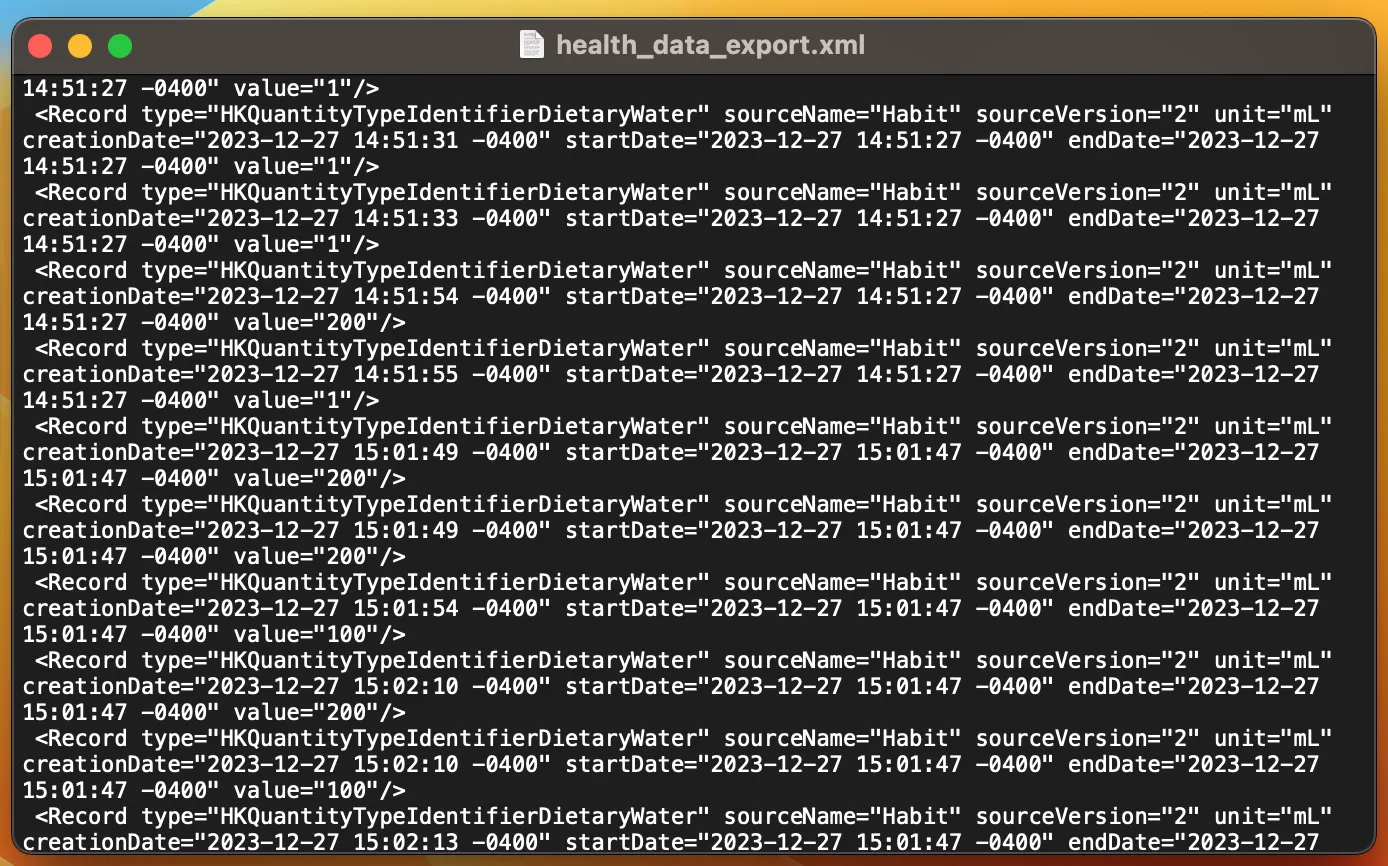
<?xml version="1.0" encoding="utf-8"?><feed xmlns="http://www.w3.org/2005/Atom" xml:lang="en"><generator uri="https://jekyllrb.com/" version="4.4.1">Jekyll</generator><link href="https://edimah.github.io/feed.xml" rel="self" type="application/atom+xml"/><link href="https://edimah.github.io/" rel="alternate" type="text/html" hreflang="en"/><updated>2026-08-07T01:13:04+02:00</updated><id>https://edimah.github.io/feed.xml</id><subtitle>Applied mathematician building reliable, mathematically grounded AI systems for regulated environments — Bayesian inference, optimisation, kernel methods, deep learning, signal processing. </subtitle><entry><title type="html">Modelling MNAR data with population data #2 : Where do the blanks cluster?</title><link href="https://edimah.github.io/blog/2026/where-do-the-blanks-cluster/" rel="alternate" type="text/html" title="Modelling MNAR data with population data #2 : Where do the blanks cluster?"/><published>2026-07-20T11:00:00+02:00</published><updated>2026-07-20T11:00:00+02:00</updated><id>https://edimah.github.io/blog/2026/where-do-the-blanks-cluster</id><content type="html" xml:base="https://edimah.github.io/blog/2026/where-do-the-blanks-cluster/"><![CDATA[ <p>The data is the Cnam Cartographie des pathologies, published on data.ameli.fr under an open licence. It gives, for each pathology group, the number of people treated and the resulting prevalence, broken down by département, by sex, by five-year age band, for each year from 2015 to 2023. It is a large and unusually fine-grained table, and it is that fineness which makes the suppression visible at all.</p> <p>The worked example throughout is the group Cnam calls «Autres cancers», in women aged 40 to 74.</p> <p>Two words on why. Cervical cancer is not broken out anywhere in this dataset. Cnam folds it into that residual group, so the group is a stand-in and nothing here is a statement about cervical screening. The age band is the one screening actually addresses, which makes it the segment where a bias would matter to a decision rather than only to a table.</p> <figure> <img src="/assets/img/ns-rate-map.png" alt="Share of withheld cells by département for Autres cancers" loading="lazy"/> <figcaption><strong>Figure 1.</strong> EDIT. Share of withheld cells by département, across all «Autres cancers» cells, every age band and both sexes. Mayotte 73%, Lozère 38%, Guyane 38%.</figcaption> </figure> <p>The first reading of the map is the obvious one, and it holds. Small territories lose more cells. Across the hundred départements the share withheld tracks population closely, and Nord, with two and a half million people, loses none at all.</p> <p>The second reading is the one worth having. Size does not explain everything. Mayotte has around 129,000 people and loses 68% of its cells. Lozère has 74,000, barely more than half as many, and loses 39%. The smaller territory keeps more of its data.</p> <p>The difference is age. Eight per cent of Mayotte’s population is aged sixty or over. In Lozère it is thirty-four per cent. Cancer prevalence climbs steeply with age, so the same headcount yields far fewer cases in a young population than in an old one. Mayotte has more people and fewer cases, and it is cases the threshold counts.</p> <p>That is the previous post seen at the scale of a territory. Population and rate both feed the count, and the map shows only the first.</p> <p>La Réunion is the control. It is young too, but it has 953,000 people, and it loses under one per cent. Enough of the first term compensates for the second.</p> <p>What the map does not support is a demographic story told on its own. These are two plausible routes to a small count, read off a pattern that is consistent with them. Confirming either would take the age structure into the model, not into the caption.</p> <p>This post covers one pathology group at département level. It does not cover the full pathology set, individual records, or any clinical reading of the rates themselves.</p> <p>One number carries into everything that follows. Across all cells, 12.1% are withheld. Narrow to women aged 40 to 74 and that falls to 0.34%, which is 65 cells, 61 of them in Mayotte. The screening age bands are the older ones, and older bands hold more cases. Choosing the segment where a bias would matter is also, here, choosing the segment where suppression is rarest.</p> <p>Next, what a model should do with a cell that has been withheld.</p> <p>Données issues de la Cartographie des pathologies et des dépenses de l’Assurance Maladie, Cnam, data.ameli.fr, licence ODbL.</p>]]></content><author><name></name></author><category term="posts"/><category term="mnar"/><category term="censoring"/><category term="screening"/><category term="dataviz"/><summary type="html"><![CDATA[The blanks are not spread evenly. Where they concentrate decides which question the data can honestly answer.]]></summary></entry><entry><title type="html">Modelling MNAR data with population data #1 : Why is this cell blank?</title><link href="https://edimah.github.io/blog/2026/why-is-this-cell-blank/" rel="alternate" type="text/html" title="Modelling MNAR data with population data #1 : Why is this cell blank?"/><published>2026-07-19T11:00:00+02:00</published><updated>2026-07-19T11:00:00+02:00</updated><id>https://edimah.github.io/blog/2026/why-is-this-cell-blank</id><content type="html" xml:base="https://edimah.github.io/blog/2026/why-is-this-cell-blank/"><![CDATA[ <p>Working with cancer screening data, I kept meeting the same thing. A prevalence table, and no value anywhere below eleven. The cell was not empty because nobody had counted. It was empty because someone had counted, found fewer than eleven people, and judged that publishing the number would expose them.</p> <p>I thought it was clever. Three women in one age band in one small territory is close to naming them.</p> <p>What I wanted to know was what it does to a model.</p> <figure> <img src="/assets/img/redacted-table.png" alt="An excerpt of the published table, with suppressed counts shown as NS" loading="lazy"/> <figcaption><strong>Figure 1.</strong> EDIT. An excerpt of the table as published. The withheld cells carry no number at all.</figcaption> </figure> <p>The rule is simple to state. If the count is too small, no count is published. What is left behind is not a zero, and it is not an oversight. It is a decision, and the decision was taken by looking at the very number we would like to have.</p> <p>The name for that is missing not at random. It matters because the two usual reflexes are both wrong. Dropping these cells discards the one thing they do tell us, which is that the count was small. Filling them with zero asserts something the data never said.</p> <p>I expected it to only affect small population territories, but turns out large populations are too.</p> <p>The reason is in the arithmetic. The threshold is applied to a count, and a count is a population multiplied by a rate. Either term can pull it below eleven. A territory with few women arrives there through the first term. A large territory arrives there through the second, whenever the rate is low enough. A young age band with a rare cancer yields very few cases even in a crowded département. Only one of those two terms is visible when you look at a map.</p> <figure> <img src="/assets/img/ns-threshold-floor.png" alt="Share of cells withheld across deciles of population and of expected case count" loading="lazy"/> <figcaption><strong>Figure 2.</strong> EDIT. Share of cells withheld, across tenths of population on the left and tenths of expected case count on the right. By expected count the share runs from 93% to 0%. By population it runs only from 13% to 1%, and not even in order.</figcaption> </figure> <p>The right panel sorts cells by how many cases we would expect them to contain. It separates them almost perfectly. The left panel sorts the same cells by how many people they contain, and it barely separates them at all. The very smallest populations are in fact less affected than the tenth just above them.</p> <p>So the honest reading is not that small territories disappear. What disappears is small counts, wherever they come from.</p> <p>In other words, the threshold sees one number, and that number is a product. We are shown only one of its factors.</p> <p>Next, where those blanks actually fall, and what that decides about the question we can ask.</p> <p>Données issues de la Cartographie des pathologies et des dépenses de l’Assurance Maladie, Cnam, data.ameli.fr, licence ODbL.</p>]]></content><author><name></name></author><category term="posts"/><category term="mnar"/><category term="censoring"/><category term="screening"/><category term="bayesian"/><summary type="html"><![CDATA[A blank cell in the pathology data is a decision, not an absence, and the decision depends on the number it hides.]]></summary></entry><entry xml:lang="fr"><title type="html">Incidence du cancer de la prostate en France d’Outre Mer et Métropolitaine</title><link href="https://edimah.github.io/blog/2025/prostate-dom-metropole/" rel="alternate" type="text/html" title="Incidence du cancer de la prostate en France d’Outre Mer et Métropolitaine"/><published>2025-11-15T10:00:00+01:00</published><updated>2025-11-15T10:00:00+01:00</updated><id>https://edimah.github.io/blog/2025/prostate-dom-metropole</id><content type="html" xml:base="https://edimah.github.io/blog/2025/prostate-dom-metropole/"><![CDATA[<h2 id="résumé-">Résumé 🧵</h2> <p>À partir des données fiables disponibles auprès de l’Observatoire Mondial du Cancer de l’OMS, (GLOBACAN/IARC)<sup id="fnref:1"><a href="#fn:1" class="footnote" rel="footnote" role="doc-noteref">1</a></sup>, j’ai comparé les taux d’incidence standardisés du <strong>cancer de la prostate</strong> en France métropolitaine et dans plusieurs territoires d’Outre-mer.</p> <p>Les écarts sont importants : la Guadeloupe et la Martinique présentent des valeurs nettement supérieures à la moyenne métropolitaine, et aux autres territoires étudiés.</p> <p>Dans le cadre de Novembre Bleu 🔷, ce billet cherche à fournir un point d’appui chiffré pour la <strong>sensibilisation</strong> et à ouvrir la discussion sur les facteurs possibles — génétiques, environnementaux et socio-économiques.</p> <h2 id="données--méthode">Données &amp; Méthode</h2> <p><strong>Données</strong> : relevés d’incidence du cancer de la prostate (GLOBOCAN 2022)<sup id="fnref:1:1"><a href="#fn:1" class="footnote" rel="footnote" role="doc-noteref">1</a></sup> par pays.<br/> <strong>Indicateur</strong> : taux d’incidence standardisés monde (<em>TSM</em> / <em>ASR</em> en français) pour 100 000 habitants.</p> <h3 id="traitement-des-données">Traitement des données</h3> <p>Les données ont été traitées sous R (<code class="language-plaintext highlighter-rouge">tidyverse</code>, <code class="language-plaintext highlighter-rouge">ggplot2</code>) : la base mondiale a été filtrée sur R pour isoler les territoires français.</p> <p>⚠️ Les méthodologies variant d’un territoire à l’autre, les comparaisons doivent rester prudentes. <sup id="fnref:2"><a href="#fn:2" class="footnote" rel="footnote" role="doc-noteref">2</a></sup></p> <p>La base résultante inclut les territoires suivants, sur lesquels nous avons basé notre étude :</p> <ul> <li>France métropolitaine</li> <li>Guadeloupe</li> <li>Martinique</li> <li>Guyane</li> <li>La Réunion</li> <li>Polynésie française</li> </ul> <p>Le code complet et le dataset utilisés sont disponibles dans mon dépôt GitHub <a href="https://github.com/Edimah/public-health">public-health</a>.</p> <p>L’aborescence des fichiers concernés est la suivante :</p> <div class="language-plaintext highlighter-rouge"><div class="highlight"><pre class="highlight"><code>📂 public-health/
├── cancers/
│   └── prostate_continental_FR_overseas.R
├── data/
│   ├── dataset-inc-males-in-2022-prostate.csv
│   ├── french_prostate_incidence_2022.csv
│   └── french_prostate_incidence_2022.rds
└── exports/
  ├── prostate_asr_table_en.csv
  ├── prostate_asr_table_en.md
  ├── prostate_incidence_france_overseas_en.png
  ├── prostate_incidence_france_overseas_fr.png
  ├── prostate_tsm_table_fr.csv
  └── prostate_tsm_table_fr.md
</code></pre></div></div> <p>Le script R <code class="language-plaintext highlighter-rouge">prostate_continental_FR_overseas.R</code> :</p> <ol> <li>lit le CSV brut (<code class="language-plaintext highlighter-rouge">dataset-inc-males-in-2022-prostate.csv</code>) dans <code class="language-plaintext highlighter-rouge">data/</code>,</li> <li>crée les jeux filtrés (CSV/RDS) dans le ficher <code class="language-plaintext highlighter-rouge">data/</code>,</li> <li>puis alimente les visuels et tableaux qui sont déposés dans <code class="language-plaintext highlighter-rouge">exports/</code>.</li> </ol> <h2 id="résultats">Résultats</h2> <p>Les résultats de ce traitement sont résumés dans le tableau suivant :</p> <table> <thead> <tr> <th style="text-align: left">Région</th> <th style="text-align: right">TSM (monde)</th> </tr> </thead> <tbody> <tr> <td style="text-align: left">Guadeloupe</td> <td style="text-align: right">157.5</td> </tr> <tr> <td style="text-align: left">Martinique</td> <td style="text-align: right">134.3</td> </tr> <tr> <td style="text-align: left">Guyane française</td> <td style="text-align: right">94.1</td> </tr> <tr> <td style="text-align: left">France métropolitaine</td> <td style="text-align: right">82.3</td> </tr> <tr> <td style="text-align: left">Polynésie française</td> <td style="text-align: right">62.3</td> </tr> <tr> <td style="text-align: left">La Réunion</td> <td style="text-align: right">59.6</td> </tr> </tbody> </table> <blockquote> <p>On observe que les incidences observées en <strong>Martinique</strong> et <strong>Guadeloupe</strong> sont environ <strong>2 fois plus élevées</strong> que celles de la Métropole, et presque 3 fois plus élevées que celles de La Réunion.</p> </blockquote> <p>Cela rejoint les constats établis par Santé Publique France dans le Bulletin Epidemiologique Hebdomadaire (BEH) publié le 15 novembre 2016 : <a href="https://beh.santepubliquefrance.fr/beh/2016/39-40/2016_39-40_6.html?utm_source=chatgpt.com"><em>Le cancer de la prostate aux Antilles françaises : état des lieux</em></a><sup id="fnref:3"><a href="#fn:3" class="footnote" rel="footnote" role="doc-noteref">3</a></sup>.</p> <p>Le tableau peut être résumé sous forme d’histogramme. Ci-dessous nos comparons ainsi l’incidence du cancer de la prostate dans les cinq territoire d’Outre-Mer étudiés (en bleu) avec celle de la Métropole (en gris).</p> <figure> <img src="/assets/img/santepub/prostate_dom_metropole.png" alt="Incidence du cancer de la prostate – DOM et métropole" loading="lazy"/> <figcaption> Incidence standardisée (TSM) – DOM vs métropole, source GLOBOCAN 2022 (script R <code>prostate_continental_FR_overseas.R</code>). </figcaption> </figure> <h2 id="discussion--comment-comprendre-ces-écarts-">Discussion : comment comprendre ces écarts ?</h2> <p>Les écarts d’incidence observés sont documentés dans plusieurs rapports et publications scientifiques. Aucun facteur ne suffit à lui seul ; il s’agit a priori d’un phénomène multifactoriel qui inclut</p> <h3 id="1-des-facteurs-génétiques">1. Des facteurs génétiques</h3> <p>Les hommes d’ascendance africaine présentent un risque plus élevé de développer un cancer de la prostate. Les populations antillaises sont donc plus exposées à ce facteur<sup id="fnref:4"><a href="#fn:4" class="footnote" rel="footnote" role="doc-noteref">4</a></sup>.</p> <h3 id="2-exposition-environnementale--le-chlordécone">2. Exposition environnementale : le chlordécone</h3> <p>Un certain nombre d’études menées aux Antilles montrent une association entre l’exposition au chlordécone et un risque accru de cancer de la prostate — sans établir une causalité directe. Il serait pourtant malhonnête de ne pas le mentionner. Sources : INSERM (2019) et synthèse du Sénat (2019)<sup id="fnref:5"><a href="#fn:5" class="footnote" rel="footnote" role="doc-noteref">5</a></sup><sup id="fnref:6"><a href="#fn:6" class="footnote" rel="footnote" role="doc-noteref">6</a></sup>.</p> <h3 id="3-modes-de-vie-et-facteurs-socio-économiques">3. Modes de vie et facteurs socio-économiques</h3> <p>De nombreuses raisons sont évoquées dans la littérature :</p> <ul> <li>taux élevés de surpoids et obésité,</li> <li>accès inégal au dépistage,</li> <li>retards et interruptions dans les parcours de soins,<br/> Et ce parmi d’autres déterminants sociaux défavorables dans ces territoires<sup id="fnref:7"><a href="#fn:7" class="footnote" rel="footnote" role="doc-noteref">7</a></sup><sup id="fnref:8"><a href="#fn:8" class="footnote" rel="footnote" role="doc-noteref">8</a></sup></li> </ul> <h3 id="4-organisation-des-soins-et-dépistage">4. Organisation des soins et dépistage</h3> <p>Plusieurs analyses (SPF, HCSP) soulignent :</p> <ul> <li>un recours variable au dépistage selon les territoires</li> <li>des inégalités d’accès aux spécialistes</li> <li>une surveillance moins systématique des groupes à risque Ces éléments contribuent à des diagnostics parfois plus tardifs.</li> </ul> <h2 id="prévention--faisons-compter-les-données">Prévention : faisons compter les données</h2> <p>Ces résultats doivent servir de support aux actions locales : la sensibilisation reste le premier rempart à l’évolution de cette maladie.</p> <p>L’incidence élevée dans ces territoires n’est pas une fatalité : il existe des mesures de prévention et de détection précoce. Et de plus en plus d’initiatives locales pronent l’accès à l’information et aux soins adéquats.</p> <p>Les actions menées par les associations et les acteurs du monde de la santé se multiplient. Les chiffres justifient cette tendance.</p> <p><em>Image de couverture générée avec DALL-E.</em></p> <h2 id="références">Références</h2> <div class="footnotes" role="doc-endnotes"> <ol> <li id="fn:1"> <p>IARC / WHO. <em>GLOBOCAN 2022: Prostate cancer incidence by country</em>. Disponible via https://gco.iarc.fr/today/, téléchargement des tables CSV correspondant aux taux d’incidence du cancer de la prostate et filtré par pays (“Countries”) (consulté en 2025) avant traitement de données externe. <a href="#fnref:1" class="reversefootnote" role="doc-backlink">&#8617;</a> <a href="#fnref:1:1" class="reversefootnote" role="doc-backlink">&#8617;<sup>2</sup></a></p> </li> <li id="fn:2"> <p>IARC / WHO. <em>GLOBOCAN 2022: Data &amp; methods by country</em>. Disponible via https://gco.iarc.who.int/today/en/data-sources-methods-by-country-detailed?tab=5 (consulté en 2025) <a href="#fnref:2" class="reversefootnote" role="doc-backlink">&#8617;</a></p> </li> <li id="fn:3"> <p>Bousquet P.J. et al. “Le cancer de la prostate aux Antilles françaises : état des lieux.” <em>Bulletin Épidémiologique Hebdomadaire</em> (BEH), 15 novembre 2016. https://beh.santepubliquefrance.fr/beh/2016/39-40/2016_39-40_6.html. <a href="#fnref:3" class="reversefootnote" role="doc-backlink">&#8617;</a></p> </li> <li id="fn:4"> <p>Benafif S., Eeles R. “Genetic predisposition to prostate cancer.” <em>Nature Reviews Urology</em>, 2018. https://www.nature.com/articles/nrurol.2018.22. <a href="#fnref:4" class="reversefootnote" role="doc-backlink">&#8617;</a></p> </li> <li id="fn:5"> <p>INSERM. <em>Exposition aux pesticides et au chlordécone</em>. Rapport 2019. https://www.inserm.fr/wp-content/uploads/2019-06/inserm-rapportexpositionauxpesticidesetauchlordecone-2019.pdf. <a href="#fnref:5" class="reversefootnote" role="doc-backlink">&#8617;</a></p> </li> <li id="fn:6"> <p>Sénat. “Chlordécone et cancer de la prostate.” Question écrite n°0587S, 2019. https://www.senat.fr/questions/base/2019/qSEQ19010587S.html. <a href="#fnref:6" class="reversefootnote" role="doc-backlink">&#8617;</a></p> </li> <li id="fn:7"> <p>HCSP. <em>Inégalités sociales et cancer aux Antilles</em>. Rapport 2022. https://www.hcsp.fr/Explore.cgi/Telecharger?NomFichier=ad913637.pdf. <a href="#fnref:7" class="reversefootnote" role="doc-backlink">&#8617;</a></p> </li> <li id="fn:8"> <p>Le Quotidien du Médecin. “Guadeloupe, Martinique, La Réunion : constat amer pour les premières études de survie du cancer.” 2023. https://www.lequotidiendumedecin.fr/actu-medicale/guadeloupe-martinique-la-reunion-constat-amer-pour-les-premieres-etudes-de-survie-du-cancer. <a href="#fnref:8" class="reversefootnote" role="doc-backlink">&#8617;</a></p> </li> </ol> </div>]]></content><author><name></name></author><category term="posts"/><category term="sante-publique"/><category term="dataviz"/><category term="depistage"/><summary type="html"><![CDATA[Visualiser l'écart d'incidence entre des territoires français ultramarins et l'Hexagone en 2022.]]></summary></entry><entry><title type="html">How to import and use Apple Health data with R</title><link href="https://edimah.github.io/blog/2025/importing-and-visualising-fitness-data/" rel="alternate" type="text/html" title="How to import and use Apple Health data with R"/><published>2025-09-27T00:34:16+02:00</published><updated>2025-09-27T00:34:16+02:00</updated><id>https://edimah.github.io/blog/2025/importing-and-visualising-fitness-data</id><content type="html" xml:base="https://edimah.github.io/blog/2025/importing-and-visualising-fitness-data/"><![CDATA[<p>I’ve been using my iPhone and Apple Watch’s health features consistently for almost <strong>two years</strong> now.<br/> That’s more than <strong>20 months</strong> of all sorts of logs (workouts, heart rates, daily activity summaries…) just sitting on my phone.</p> <p>This treasure trove of personal data has always intrigued me. With it, I could answer many questions about the way my body works, to change the way I train, how I manage load, rest days, etc.</p> <p>But before answering any fitness questions, I first had to answer an obvious technical one :</p> <blockquote> <p><strong>How do I get all that data into a clean, usable format?</strong></p> </blockquote> <p>That’s what my <a href="https://github.com/Edimah/apple-health-data"><strong>Apple Health Data GitHub repo</strong></a> is about. Here’s what it does.</p> <hr/> <h3 id="1-export-the-data">1. Export the data</h3> <p>From the Apple Health app.</p> <ol> <li>Click <em>Profile</em></li> <li>Click <em>Export Health Data</em></li> </ol> <p>Unzipping it reveals this folder.</p> <p><img src="/assets/img/apple_health_export_folder.png" alt="Health Export Folder" title="Health Export Folder" style="max-width: 50%; height: auto;"/></p> <p>It’s full of workout logs, heart rates, activity summaries, ECGs, GPS routes… A treasure trove as I said. But not very readable by the human eye so far.</p> <p>The meat of the export is in the two XML files which both contain the same information (<code class="language-plaintext highlighter-rouge">export_cda.xml</code> just follows <em>Clinical Data Architecture</em> standards favoured by some administrations). The file <code class="language-plaintext highlighter-rouge">export.xml</code> is a good place to start. Only issue is, it looks like this :</p> <p><img src="/assets/img/apple_health_xml_preview.png" alt="Export XML preview" title="Export XML preview" style="max-width: 50%; height: auto;"/></p> <p>Yeah.</p> <hr/> <h3 id="2-parse--clean-it">2. Parse &amp; clean it</h3> <p>Thankfully, R has appropriate tools to deal with this format and extract information from this word soup. The R script <code class="language-plaintext highlighter-rouge">01_import_health_data.R</code> does the following :</p> <ul> <li>Parse the XML with <code class="language-plaintext highlighter-rouge">xml2</code>. <ul> <li>Isolate the nodes of interest (I picked <code class="language-plaintext highlighter-rouge">Workout</code>, <code class="language-plaintext highlighter-rouge">WorkoutStatistics</code>, and <code class="language-plaintext highlighter-rouge">ActivitySummary</code>).</li> <li>Convert them into <strong>tibbles</strong> dataframes.</li> </ul> </li> <li>Clean the dataframes. <ul> <li>Transform dates and numbers into proper date-time and numeric R objects.</li> <li>Simplify the names by removing useless prefixes (e.g. <code class="language-plaintext highlighter-rouge">HKWorkoutActivityTypeYoga</code> → <code class="language-plaintext highlighter-rouge">Yoga</code>).</li> </ul> </li> </ul> <p>There. Megabytes of XML file neatly distilled into a few tidy CSV files, a format R handles well. It also saves us the pain &amp; computing power from having to “import-parse-clean” the data all over again.</p> <hr/> <h3 id="3-have-fun-with-the-results">3. Have fun with the results</h3> <p>With a solid data pipeline in place, sky’s the limit really…</p> <p>The second script, <code class="language-plaintext highlighter-rouge">02_visualise_health_data.R</code>, loads those CSVs and builds interactive plots with <code class="language-plaintext highlighter-rouge">ggplot2</code> + <code class="language-plaintext highlighter-rouge">plotly</code>.</p> <p>I made a <strong>bar plot</strong> of my workout distribution as an example. Hover to see counts for each activity:</p> <iframe src="/assets/html/workout_types_20250926_221543.html" width="100%" height="600" frameborder="0"></iframe> <hr/> <p>This graph alone doesn’t say much about performance or trends, but it does offer a bit of a surprise insight: yoga dominates my routine 🧘🏿‍♀️. Sprinkling short flows before and after other workouts adds up !</p> <p>My next step will be to explore trends in heart rates, recovery and load. A good opportunity to explore R’s time series capabilities.</p>]]></content><author><name></name></author><category term="posts"/><category term="dataviz"/><category term="fitness"/><category term="health"/><summary type="html"><![CDATA[I imported 20 months of Apple Health data 🏃🏿‍♀️ to get a broader view of how I trained.]]></summary></entry></feed>