How to import and use Apple Health data with R
I’ve been using my iPhone and Apple Watch’s health features consistently for almost two years now.
That’s more than 20 months of all sorts of logs (workouts, heart rates, daily activity summaries…) just sitting on my phone.
This treasure trove of personal data has always intrigued me. With it, I could answer many questions about the way my body works, to change the way I train, how I manage load, rest days, etc.
But before answering any fitness questions, I first had to answer an obvious technical one :
How do I get all that data into a clean, usable format?
That’s what my Apple Health Data GitHub repo is about. Here’s what it does.
1. Export the data
From the Apple Health app.
- Click Profile
- Click Export Health Data
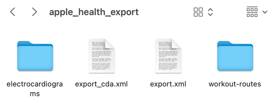
Unzipping it reveals this folder.

It’s full of workout logs, heart rates, activity summaries, ECGs, GPS routes… A treasure trove as I said. But not very readable by the human eye so far.
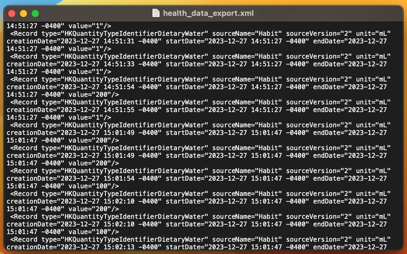
The meat of the export is in the two XML files which both contain the same information (export_cda.xml just follows Clinical Data Architecture standards favoured by some administrations). The file export.xml is a good place to start. Only issue is, it looks like this :

Yeah.
2. Parse & clean it
Thankfully, R has appropriate tools to deal with this format and extract information from this word soup. The R script 01_import_health_data.R does the following :
- Parse the XML with
xml2.- Isolate the nodes of interest (I picked
Workout,WorkoutStatistics, andActivitySummary). - Convert them into tibbles dataframes.
- Isolate the nodes of interest (I picked
- Clean the dataframes.
- Transform dates and numbers into proper date-time and numeric R objects.
- Simplify the names by removing useless prefixes (e.g.
HKWorkoutActivityTypeYoga→Yoga).
There. Megabytes of XML file neatly distilled into a few tidy CSV files, a format R handles well. It also saves us the pain & computing power from having to “import-parse-clean” the data all over again.
3. Have fun with the results
With a solid data pipeline in place, sky’s the limit really…
The second script, 02_visualise_health_data.R, loads those CSVs and builds interactive plots with ggplot2 + plotly.
I made a bar plot of my workout distribution as an example. Hover to see counts for each activity:
This graph alone doesn’t say much about performance or trends, but it does offer a bit of a surprise insight: yoga dominates my routine 🧘🏿♀️. Sprinkling short flows before and after other workouts adds up !
My next step will be to explore trends in heart rates, recovery and load. A good opportunity to explore R’s time series capabilities.